
In this article, Dulux Trade explores the pivotal role that colour plays in how a building functions for its occupants – physically, cognitively, and emotionally. From wayfinding in a healthcare setting to promoting focus for students in a classroom, specifiers who choose the right palette can make a measurable difference.
Colour as a communicator
Colour does more than just decorate – it communicates. Colour evokes emotion, influences mood, and alters perception of scale or warmth. Warm hues can add intimacy and energy, while cooler tones often create a sense of calm and spaciousness.
It’s not just about creating ambience. Designers should consider how colour is used to influence how people experience a space. In learning environments, for example, muted blues and greens can reduce overstimulation and support focus, particularly beneficial for neurodivergent students. In contrast, warmer accents can promote sociability in communal areas like breakout zones or cafés.
Biophilic palettes are inspired by natural tones and help communicate a sense of safety and calm. Though greens and blues are most commonly used, biophilic schemes can include earthen tones, stormy greys, and sandy neutrals to help ground occupants.
Every sector has its own colour considerations that specifiers must bear in mind:
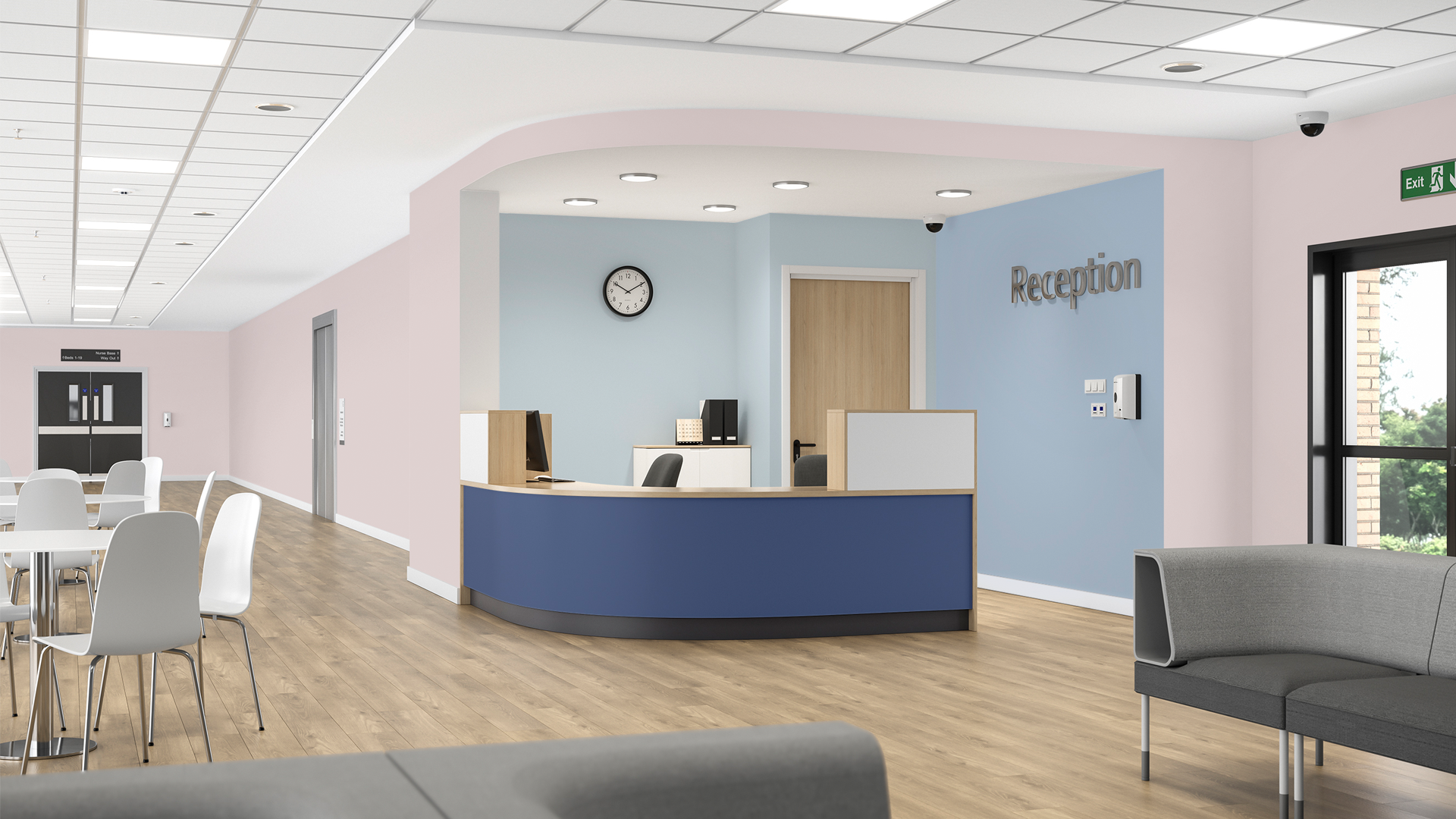
- Healthcare: Use colour to aid navigation and reduce stress. Focus on calm palettes with clear contrast to help occupants orient themselves within the space.
- Education: Balance focus and stimulation with contrasting tones. Use cool tones in learning zones and warm, vibrant colours in social areas and creative spaces.
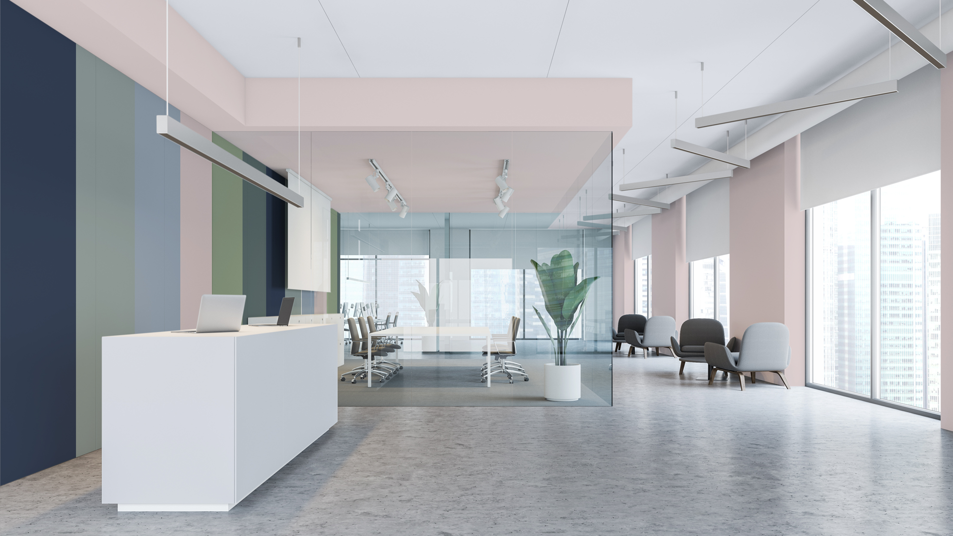
- Workplaces: Neutral and cooler tones are ideal for concentrated work areas. Bolder tones help promote productivity in breakout and collaboration spaces.
- Residential and care: Inclusivity in these spaces is all about wayfinding and accessibility. Use strong contrast between walls, floors, and doors to help older adults and people living with dementia navigate the building.
The effective use of colour in a space is more than just a concept. It’s also directly linked to inclusivity, neurodiversity, and safety…
Colour and inclusive design
Inclusive design ensures environments are usable by everyone, regardless of age, ability, or neurodiversity. This means specifiers need to consider access, comfort, clarity, and emotional reassurance in their design.
You can use colour to help differentiate zones, highlight hazards, and reinforce independence. The use of contrasting colours on critical surfaces, such as doors and walls, helps improve spatial awareness and supports more straightforward navigation.
To help with compliance, the British Code of Practice BS 8300-2:2018 and Building Regulations Approved Document M, Vol. 2 (2015) recommend a minimum 30-point contrast in Light Reflectance Value (LRV) between key adjacent surfaces.
Dulux Trade supports designers by including published LRV data with every colour. This means you can guarantee your space provides the right level of contrast at the specification stage.
Designing for neurodivergence
Neurodivergent people can be more sensitive to colour. Designers must be careful to find the right balance in their palettes, as schemes that are overly busy can cause sensory overwhelm, whereas dull spaces can feel cold and uninviting.
Effective use of colour balances stimulation with calm. Quiet areas benefit from soft, desaturated palettes. In more social zones, use bolder accents to boost energy.
Designers can leverage Dulux Trade’s experience in working with neurodiversity-aware clients to choose palettes that are built around sensory needs and lead to more accessible, inclusive spaces for everyone.
Paint specification and health
It isn’t just colour that affects wellbeing in a space. The paint itself matters too. Specifiers need to consider how the presence of volatile organic compounds (VOCs) in conventional paint can influence indoor air quality and overall respiratory health.
Specifiers can choose Dulux Trade for healthier paint products. Its range prioritises low-VOC, water-based formulations for healthier environments. Products like Dulux Trade Vinyl Matt and Dulux Trade Diamond Matt are 99.9% VOC-free and align with BREEAM and LEED certifications.
Further support for architects
Colour is subjective, and considering inclusivity adds an additional layer of complexity. Dulux Trade has developed tools to help make it easier for specifiers and architects to make meaningful colour choices.
- Dulux Trade Colour Schemer Tool: Test palettes by sector, purpose, and space. Preview in-situ visuals, then order A3 moodboards to present or share.
- Dulux Trade Colour and Contrast Design Guide: A go-to online tool for accessible specification and inclusive colour planning.
- Published LRV Data: Every Dulux Trade colour includes LRV figures for easy contrast checking and compliance with accessibility standards.
Support inclusive design by specifying Dulux Trade
Designing for wellbeing and inclusivity is not a trend. As our buildings adapt to serve diverse communities, colour plays an integral role in the creation of welcoming, accessible spaces.
Architects and designers who want to create spaces that work for everyone should choose Dulux Trade. Specify Dulux products directly through NBS Source or visit the Dulux Trade website to learn more.